Weekly Update: It's all about the Stegadon

This was a busy week with a trip out of state. The house is a disaster and should be cleaned, but the studio is always a disaster and hanging out in there keeps the real work at bay. Lots of work was done on the Steg model today. The highlights are coming along nicely and I'm trying out some hatching techniques that I think have been mostly successful. By hatching, I mean the fine highlighted lines that run across places like the jaw, back legs, etc. It's often used to describe a shape when you're drawing or painting on a flat surface. I've seen other folks use it on models as well and liked the results. There's plenty of detail work left to do - all the horns and spikes need highlights, metals need painting, and the howdah is in progress. Check out the little duffer:

7th edition Stegadon WIP 2
7th edition Stegadon WIP - detail of head 2
7th edition Stegadon WIP - detail of head
7th edition Stegadon WIP

Tip of the Week: Buy the Best Brushes

“The expectations of life depend upon diligence; the mechanic that would perfect his work must first sharpen his tools.” - Confusious

Primed White modelLots of time observing, thinking, and painting makes a great painter, but starting with the right tools for the job is also necessary to produce quality work. Let's face it - applying color to a miniature isn't easy. It takes patience, concentration, a good hand, the right mix of paint, and on and on and on. Anything that gives you an edge is worth having and the right type of brush will help.

Many mini painters will ask, "Why have all my brushes started to curl and fall apart, and what can I do to fix them, and why don't they hold paint well, and why do I hate my dad and that girl I like won't talk to me?" Here's an answer to the parts related to brushes: You're likely using a brush made with nylon or some other less-than-desirable material. The hairs that make the brush are also probably squished and poorly glued into the ferrule.

A good brush for miniatures will be made of Kolinsky sable. I have found a few companies that I like better than others, but wholeheartedly recommend any of the following: Da Vinci Maestro, Winsor & Newton Series 7, and Escoda. With proper care, these brushes will last for years.

"But Midloo, those are expensive and I still hate my dad." To address the former part of the comment: It's true - a quality brush will cost you more than the junk GW or your local dive sells, but the price is more than worth it. Let's do some quick math: A nylon brush will set you back between 50 cents and 5 dollars. With luck, it will retain it's shape and last you slightly more than a handful of painting sessions. If purchasing online, one of the recommended Kolinsky brushes will cost between $10 and $25 dollars and will last hundreds of painting sessions. It will remain springy and in perfect shape time and again. It will hold a more appropriate amount of paint and allow you to more easily achieve the effects you're after. It will even get that girl to talk to you.... well, a painter should be a dreamer. It's tough to overcome that initial cost, but believe me - you'll be much happier every time you paint.

A good brush will remove one of the obstacles to finishing great miniatures. Do yourself a favor if you haven't already and take the plunge. If you're upset with the purchase, feel free to blame your dad.

Questions? Comments? Brush horror stories? Let us know!

You Have to See This: Wet Palette

Paint Palette


A good friend on the Wisconsin Warhammer Fantasy Battles site put up a great tutorial on how to make a wet palette. I haven't tried this out myself, but I've seen the results of his work with it and they're mighty fine. Take a look and let him know if you have success with it.

Click here for a nice wet palette.

Wait that's not it... that's Karin Viard in her prime. Try this instead: Wet Palette

mmm hmm

Weekly Update: Going East - to West VA

I'm in West Virginia today, but through the magical properties of Blogger, this post was created in advance to give everyone a weekly update.

That weekly update is: My wife will hurt me if I don't finish packing the car and get out of here. And I'm making good progress on the Stegadon - pictures soon. Also found a Forgeworld Mammoth that I couldn't pass up, so expect some pics from that work in progress in the near future as well.

Have a great weekend, all!

Tip of the Week: Be the Jack Sprat of Painting

Jack Sprat Illustration
“Jack Sprat could eat no fat
His wife could eat no lean…”


When you’re painting, be like Jack, my fellow mini fans: Keep your paint lean.

If there’s one immediate thing that every painter should do as they strive to paint better minis, it’s thin their paint. Great globs of paint pulled right from the tube, eyedropper, or pot are not suitable to apply to your models. It’s simple: Thicker paint goes on more thickly and covers up or smooths over the precious tiny details of your miniature. Thick paint also doesn’t allow you to easily create effective layering and blending techniques.


Piles of pigment
Piles of pigment - not to be freebased
Let’s take a quick look at what paint is actually made of to better understand why thinning is always a good idea. Anyone remember Chemistry class? (Yeah I don’t either) Paint is a mixture. It’s made of two different things: Pigment and an emulsifier. Pigment is a very intensely colored and fine-grain powder. An emulsifier is what that pigment is suspended in so that it becomes more liquid. In the case of acrylic paints, the emulsifier is an acrylic polymer that can be thinned with – you guessed it – water. Oil paint can be suspended in a variety of substances that are able to be thinned with oil based solvents like turpentine, mineral spirits, or even brake fluid if you’ve a spare car but no $5 bottle of any other solvent. When you thin your acrylic paint with water, you’re adding one more material to the mixture and forcing a smaller amount of pigment and emulsifier to exist in the same space.

Did that make sense? Still with me? If not, don’t worry. The bottom line is simple- Thinning your paint is ultimately going to give you more control over how your paint goes onto the model. It’s a process that takes practice as varying the amount of water you use will allow you to achieve different effects. Different colors will also react differently to being thinned. Here are some general rules I like to follow:

- A wash of paint is about 15% paint and 85% water
- A standard application of paint is about 30% paint to 70% water – around the consistency of whole milk


Painting Diagram


Just playing around with thinning your paint is going to help make you a better painter. Make sure you are using a clean glass of water. It’s even nice to have a few cups of water out at a time: One completely clean and clear cup of water for mixing with the paint, one for cleaning brushes, and one for cleaning brushes with metallic paint so that it’s reflecting flakes don’t get into your other colors.

Controlling thinned paint creates some new challenges and can be frustrating, but here are a few tips to keep you from throwing that ForgeWorld Bloodthirster against the wall, boxing up the bits, and sending them all to my home address in anger (though I will happily retain them).

- Use a plastic water color palette or the like to hold your paint and water mixtures. I’m poor and eat a lot of spaghetti and use the lids from pasta sauce jars.

- You’ll often find it easiest to pull water directly from your clean cup and into a bit of paint. After you’ve used the brush to mix the water into the paint, immediately wipe your brush on a paper towel to clean all the excess paint off. Then put your brush back into the new mixture you’ve created and only take out a small amount. When you touch the brush to your model, the paint should go on thinly and not go on like big raindrops. Be patient and continuously dip your brush back into your thinned paint to pick up a small amount at a time.

- If you’re putting your paint on as described above, then each stroke should dry quickly, but don’t paint another layer on top of a previous one without allowing it to dry. Use a hairdryer on low if you have to.

- Another brush that is dry should be kept close by. Don't use this for putting paint onto the model. If too big a drop of watery paint forms on the model, you can suck up the excess with the trusty dry brush always at your side.


So there’s the tip of the week: thin every stroke of paint that touches your model with some amount of water! Please leave me a comment to let me know if this was useful to you or not. Any questions? Send those as well!

Tutorial: Glazing = Good


So you've got a base coat or an initial wash or two on your model. You've started building up the highlights and it's looking pretty good. If you've gone this far, your model is more than tabletop worthy and is probably already impressing the local gang. Want to take it a step further and try a new technique? Then glazing may be for you.

Glazing over a model is just that - you're creating a thin and slightly tinted film of paint that will inform the colors underneath. Think of it like placing one color of stained glass over another.


Photobucket
Glazing is a boon when used sparingly, but watch out. Too much glazing will drain your piece of it's immediacy and impact. It's just like Xanax - sure it will get you on the plane, but take too many and you're not going to be very interesting company when you get where you're going. Too much glaze can also create a glassy effect that will rob the model of the light it's trying to reflect. I often follow a glaze with another round of slight highlights to add a bit more punch to the surface of a model. The acrylic medium you would use to create a glaze comes in many different forms with varying viscosity, sheen, etc. I prefer a fluid medium for minis. So we're all on the same page, here are links to some of the products that I like to use: Medium


To illustrate some basic glazing techniques, let's take a look at some work-in-progress shots of the Stegadon currently on the bench. The first two pictures show the model after receiving a few green and blue washes to develop a starting tone and some built up highlights to the belly. This guy is looking pretty good, but what if you would like the transition of color between the highlights to be a bit more smooth? Simple - time to mix up a glaze!

The process of making a good glaze depends on the color and how much you'd like to knock the undercoat back, but in general, a mixture of about one-third paint, one-third medium, and one-third water will be a good starting point. Unless you are going for a specific effect, glazes should go on thinly. Make sure your brush isn't overloaded and sagging with paint - using an appropriate amount will take some practice. The nice thing about glazes is that they are very forgiving. If they go on too thick, you've enough open time to work any large deposits out with your brush. One application should usually alter the color only slightly.


Let's focus back in on that Stegadon's belly. Here are shots of the model after receiving his first glaze. I mixed up a very light yellow and brushed it on over the majority of the underside. Take a look at the images after the jump and you should be able to see a distinct difference between the model after this first glaze and the previous stage with highlights only. The glaze evens out all the pronounced highlights and makes them gel together.


The glaze was starting to work, but I felt that it could benefit from one more light application. The images to the left show the result of this second pass. There's now a unified, but not entirely even and boring coat of paint. This is starting to achieve that beautiful sort of surface that comes from glazing.

Though as mentioned above, if you compare these shots of the model after a second glaze to those of the first two images with only the highlights, you can see that some of the immediacy and impact of the bold strokes of paint in the original highlights has been knocked back by the glaze. This is why I often like to finish with another layer of highlighting as shown below.


With this final step, the model comes full circle in a way. Hopefully you can see what glazing adds to the final piece. The foundation we laid down through all that painting created a rich surface on which our final highlights can ride. What if you find your final highlights are again too stark? You guessed it - glaze it back again and rework your way to the highlights!

Ultimately, glazing is one more trick in your painting bag and I hope it's one you can use. Please let me know what you got out of this article. Was it useful? Anything confusing? Could anything be better? Thanks for taking the time to make it to the bottom :)

You Have to See This: Tiny Souls


Howdy Gang - This is the first post in a new weekly segment. It's purpose is to get you to other great corners of the internet that I have found inform or expand my interest in the hobby or art in general.

To kick things off, I want to direct your attention to one of my favorite painters - Zordana. Her site is called Tiny Souls and it is not to be missed. She recently redesigned it's format and you can find a link to her archives in the siderbar of the new site. There's a bunch of great material and beautiful images of her work.

Check her out: Tiny Souls

Weekly Update: Stegadons, Orcs, and Blog Revamps - oh my!

This was a productive week. I took some time to work on the blog - that involved some HTML and Javascript lessons. Awesome... I should be at about the skill level of a 13 year old MySpace addict now. My humiliation is the blog's gain! *AHEM* check the slick favicon *ahem* *cough*

Warhammer Fantasy Savage Orc Command

Here are the beginnings of some Savage Orc Command models for Warhammer Fantasy. I wasn't a big fan of the more recent O&G designs, but these guys aren't bad. At least they're wearing an animal... Wish I could pull this look off around work. These were actually begun with the leftover paint in the tray from the big fella below.


Warhammery Fantasy

I'm not a big fan of this model and initially bought the new kit for some of the other plastic parts on the sprue, but after taking a closer look, I decided on a master plan that has now been set in motion.... Mwu ha ha ha ha. This is a shot of my converted Stegadon after the first couple of washes. Extensive putty work was done to add length to the legs so that this fine gentleman will be rearing up off his base. The head and neck was also heavily altered so that the face is turned outward in a more dramatic pose. I'm going to incorporate pieces of both the old and new howdah to finish this guy. Big plans... stay tuned!

Here are some more shots of the work in progress:


detail of head of StegadonDetail of hide of Stegadon

You can see how keeping your paints thin in the first few initial washes really helps start building a nice tonality to the piece. The recessed areas take in more paint and become shadowed; this needs to be carefully controlled while applying though or there will be a mess!

Converted 6th edition Stegadon Engine of the Gods

My previous edition Stegadon is readied for some serious painting as well. I liked the look of some of the new kit's parts on him, so here's a converted Engine of the Gods Design.

Tutorial: Mordor Troll

My goal in writing this is to give you an idea of my working and thought processes as a project like the Mordor Troll comes together.

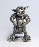
As always, the model was primed white. I like both Krylon and Games Workshop spray primer, but I like the price of the former much better and used it on this project. This excellent website is a great visual reference for anything from the films and I used it again here: Lord of the Rings Image Library

Painting on the troll began with a series of controlled dark brown washes on the flesh areas. By controlled, I mean that large pools of color in places where they 
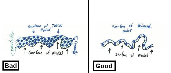
didn’t belong were removed with a separate dry brush that’s readied at the side of my painting area for that purpose. Thin your paint considerably – I go about 20% pigment to water, but it’s a very touchy-feely process depending on the color and will come better with experience. Getting the hang of doing clean work with thinned paint isn’t easy, but it will pay dividends once you start to master it. Think about these initial layers as your first chance to describe the model. Brush strokes should match the movement of the area being painted. For instance, paint laterally across a bulging stomach or beefy thigh; don’t just slop on a wash without thinking about how the paint is being applied and settling onto your model. The troll's back was washed an additional time to deepen the crevasses and complete the initial coloring.

black and white detail of Mordor Troll leg

I like starting from white and washing on the first few base coats because it immediately gives the model some life and quality to the paint coverage. Now that there was a rich brown base, I started building up the highlights on the skin. My paint is always thinned to about the consistency of whole milk, but not to the point of the beginning washes. The model is nicely sculpted and it's fairly clear where areas of light and shadow should go. Generally all but the most recessed areas were painted with a slightly lighter shade than the wash. Increasingly smaller surface areas were painted with increasingly lighter shades - almost like a topographical map. Where the transition wasn't smooth, I mixed up a glaze of about 30% gel medium, 40% water, and 30% paint. This was brushed on thinly and smoothly to help even out and blend the highlights together. Then, if needed, more highlights were brought back on top of this glaze. You can see the product of this in the skin tones of the face and arms of the troll. Again, let the paint help describe the shape of the model when you apply it - almost like a wire frame model. For example, the paint was applied laterally around the legs like a mummy would be wrapped. This helps define the shape of the object being painted. Take a look at the picture above left. I thought this was easier to see in black and white.


Next up was the armor. I used metallic paints, but still applied them in a non-metallic fashion in order to heighten the effect of the highlights. All the armor areas were first base coated with a bright orange. Yes - it looks terrible at first, but helps to eventually give the appearance of well-worn metal when thin metallic layers are painted over it. This was coated with GW Chainmail mixed with a small amount of black. The small pieces of the armor that I felt would receive the most wear were left orange. Paying attention to where the light would strike the figure, I highlighted up to a mix of about 1:1 Mithril silver and white. Areas that needed a bit more shadow were glazed with a mix of dark brown and black.

Details of the model were then painted. These include the fabric of the troll's tattered blue rags, gloves, and leather belts and buckles. All were done with an awareness of how light would spill across the model. The parts that would be most exposed to light were slowly brought up to a lighter shade.


I worked on the base separately. It was built up with modeling clay and covered with sand and small pebbles. A rider of Rohan was lightly converted and placed where he could be easily crushed by the pitiless metal troll. This was all primed white. Take a look at my previous basing tutorial here for some more ideas. Birch seed pods were broken apart and used for the leaf clutter. There's some great information here. Now's the time to find them outdoors - so hit those local parks! The troll was pinned into both points where his feet touch the base and a small bit of heavy duty epoxy was used to make sure he wasn't going anywhere.

I hope this gives you some insight into the model. Some pictures will be coming soon!

Weekly Update: My favorite part of Mordor


Fully painted Mordor Troll from the Games Workshop Lord of the Rings range

Giant trolls. They're tough to beat if you're looking for big and ugly. While their rules in War of the Ring make them a bit soft, the fellow below will soon pretty-up a table for as long as he lasts.

The Mordor Troll is a great model and a blast to paint. This project was begun and finished in about one week of heavy painting. The more recent plastic troll kits give you plenty of options, but none beat the more detailed sculpt of this metal giant. It's just unfortunate that he was one of the severe casualties of the recent GW price increase. If you can find one of these guys for less than the ludicrous amount those citrus suckers are asking, pick one up! I didn't take great work-in-progress pics for this effort, but a tutorial post will be coming soon.

Fell Beastie and his Witch King friend


Fully painted Witch King on Fell Beast model from Games Workshop Lord of the Rings range

Games Workshop makes two excellent fell beasts in their Lord of the Rings line. The model is fragile, but has some nice details and is highly evocative of the scenes in the film. Here are some collected images from my recently completed Witch King on Fell Beast model.

The model itself was a challenge to assemble. There were many large gaps that needed a good amount of putty work, but who needs a few hours of their life away from something this cool?


Witch King on Fell Beast with Flaming Sword

Witch King with Flaming Sword

Witch King with Flaming Sword

The beast was base-coated with a dark dark brown and built up with increasingly lighter shades of gray. Burnt umber washes were applied to many parts that I felt were getting too monochromatic gray. I thought this model was going to be simple to paint, but it's subtleties were a real challenge. Some passages make me particularly happy: the glow from the sword on the rider, crosshatching on the beast's neck, veins in the wings, detail around the teeth/mouth, and armor on the head. Giving the rider reins attached to the head of his mount was an effort worth the annoyance. If you want a headache some evening, try painting thin, white filament a dark color and attaching it to a 28mm scale model.

Fell Beast wings


Fell Beast base

The base was given equal attention and I tried some new techniques. Thanks to PsychosisPC on the WWHFB.com forums for a tip: mixing Italian seasoning herbs into the sand of the base! The leaf clutter gives the ground a little more visual interest. I took another look at The Two Towers film for foliage inspiration and created the little dead grass puffs to match some of its scenes.

The Witch King model originally came with a giant mace. I've seen some other folks convert him to carry a flaming sword and I wanted to do the same. The sword has a larger scale than the rider as it is a green-stuffed WHF orc weapon, but I liked the hightened attention it's scale brings. Boom! That dude has a big flaming sword. If only we were all so lucky.


Here's a shot during the conversion:

detail of Witch King on Fell Beast being converted to carry flaming sword

Krox and friends

Two completed 5th edition Kroxigors from Games WorkshopAnother weekend and another bit of work on the Lizard army. After spending some time with the 'completed' Kroxigor model this week, I decided there was nothing wrong with gilding the lily and worked back into some of the painted model and base to dress him up a bit. There is more flora and some highlights that helped flesh out some of the geometry of the model.

No one should be alone in the world, so the Krox received a friend - another 5th edition model in the same painting scheme and with similar basing elements. I wanted these guys to have a naturalist feel to them and was thinking of a dense and humid Bornian jungle during their creation. If these guys don't look hot and muggy, let me know.

"What are those objects in front of them," you might ask? Huge, delicious, powdered donuts...

or a way to track wounds! My original idea was to create a flower stem on its own 20mm base onto which green-stuffed flowers could be placed to track wounds, but I eventually decided to make the counters a part of the model. I think it works - pleasing to the eye and functional... just like my wife. Can't do much better than that.

Two completed 5th edition Kroxigors from Games Workshopclose up of wound counters for Kroxigors
Below is a shot of the pair with their skink contingent. This is nearly the formation they will take on the tabletop per the new Lizardmen codex rules. The final unit will have 16 skinks.

Kroxigor and skink mixed unit

One Cool Krox

I spent the Valentine's weekend with two things I love: My wife, and an 11 year old model of a foolishly named lizard-creature: the Kroxigor. One of those two is tucked into bed with me every night, and the other will do the dishes every now and again if I ask sweetly.

This is the model that was destined for the product of 'Basing 202'. Again, I wanted the model to be based in the natural world and referenced a number of my photos from the local zoo before deciding upon a hybrid alligator/iguana color scheme.


Fully Painted 5th edition Kroxigor

A Poor Man's Oven

I'm impatient and I use modeling epoxy frequently. I also have a bad habit of sticking my thumb right into a painstakingly crafted sculpt that is not yet dry. Are you in this boat as well? No!?... Then go hang out on this website with my wife: (i like to party)


For the handful of you not distracted by the lifestyles of the wealthy and woebegone - I present to you, a can. This will become our oven and mine originally held 30 oz of beans. If you can still find coffee in one of these, buy it, throw out or freebase the contents, and get to work.


photograph of Midloo wearing respirator

Is that Darth Vader's nerdish brother?

Safety first with projects like these. I'll be using a rotary tool to cut into this thick can and the fumes and flash can get unpleasant. Respirator and cool-goggles are a must. See here for the repercussions of doing this with another in the area.

I want a door for my creations and a vent for the heat - this cut will accomplish both.


Finally, a cheap-o incandescent lamp is mounted above the can. Voila! One poor man's oven. The heat can be controlled by moving the light source away from the can - what a feature! I find that positioning it about 2" above the lid and cooking for 10 minutes gets the piece to the point that an errant finger won't mangle a fresh sculpt. Be careful - too much heat and your greens can melt.

Don't try to heat up any nachos in here after baking your epoxy sculpts either. That's not healthy.

Basing 201

The tried and true bases made of sand, painted in increasingly lighter brown colors, and finished with a hint of static grass are a functional way to dress up large numbers of core units. You can see some examples of these in the Dwarf of my earlier posts. I wanted to add more interest and higher relief to the bases of the larger critters in my Lizardmen army. What follows is a step-by-step walkthrough of how I tried to accomplish this - missteps and all. Follow along and succeed where I half-succeeded, intrepid reader!


Here's the Kroxigor on the table today. The pose and bulk of these older 5th edition models is great. Looking at the model gave me a sense of how I wanted the scene to play out. The mini seemed to be asking for some space to look menacing, so he was placed in the back corner.


Taking a fine Sharpie in hand, I next drew out a map of where key elements in the base would be situated. Not look like much yet? Stick with me!


Taking a step sideways, I decided that some bits of ruined civilization might look nice out there in the jungle. Time to make some cobblestone. Green stuff was flattened out on a piece of glass with a bit of Vaseline underneath to keep from sticking.


This was scored with a knife and beaten up a bit to look more weathered. Just push in the corners of some stones and make some dents here and there.


I like to use natural rocks and you can see some bits of slate arranged along the lines that were drawn. These are glued down with super-glue and covered in some air-drying clay where I didn't want the tops of the rocks jutting out.


After the green stuffed cobblestone sheet has cured, some pieces were broken off and incorporated into the base. I wanted them to look a bit sunken into the landscape, so some more clay was built up around them.


One of my favorite new basing elements was also employed beginning in this picture: moss! The three piles of fine sand glued to the top of the right-hand rock formation might not look like much at the moment, but they will bloom into something much more interesting shortly.


In comes the priming. The rocks and cobblestone have been painted a flat black, and the moss a deep brown.


The rocks are beginning to come alive with some lighter and lighter shades of grey. I start with a medium gray that's applied liberally, and work up to a shade closer and closer to pure white, highlighting smaller and smaller areas on the rocks. Think of where light would naturally be hitting the features of your base and focus on lightening those parts.


This was the first time I tried water effects. I originally thought a deep blue base would be appropriate, but changed my mind mid-stream (ouch! I know I know) and switched to brown. Ahhh... much more fitting for a little river.

The moss is looking good after being drybrushed in greens. They begin with a deep forest green and finish with a very light shade that is about 75% white and 25% green. Allow each layer to dry in between applications and paint an increasingly smaller area as you move up. This moss has about 5 passes in it.


Next I did some tests on the color water I wanted to use. Only a very small amount of paint is added. I touched the tip of a size 1 brush into the color I wanted and mixed it into a dollop of product about the size of a half-dollar. Both of the colors depicted above looked great to me, so I tried to incorporate both into the little stream. My idea was to place one color at each end and seamlessly blend them into each other in the middle.


Here you can see the result: meh! The brown base seemed to mute the effect (and I believe it is even further muted by the photograph). It was apparent, but very subtle. As the material dried, it became more clear and did have a really beautiful translucent effect as you looked through the water into the riverbed. While the 'water' was still wet, I placed some tall grass into the mix - this is a useful product, but can be a bit clumsy with which to work. A pair of tweezers is very helpful.

The stream seemed a bit shallow after one pass, so I did another with the same blue-tinted composition. This took away the nice effect of being able to see the riverbed - my greatest regret with this piece. On the next attempt, I will use a less intense blue paint in the mix, and less paint in general.

That being said I'm very happy with the way this first effort turned out. The base was dressed up with some cattails and some clump foliage.


A weak stream.. just like grandpa


Stay tuned for the finished piece- Kroxigor and all.